Lines Under Load
In this violet suit, Krizia turns an ordinary jacket into a piece of contour drawing. Narrow cords in purple, red and blue circle the neck, cross the shoulders and finish at the cuffs. They don't merely sit on the fabric. They describe the garment's architecture, making the upper body look broad and the waist unusually exact. Below, the same logic changes direction: horizontal ridges compress the skirt into a dense column.
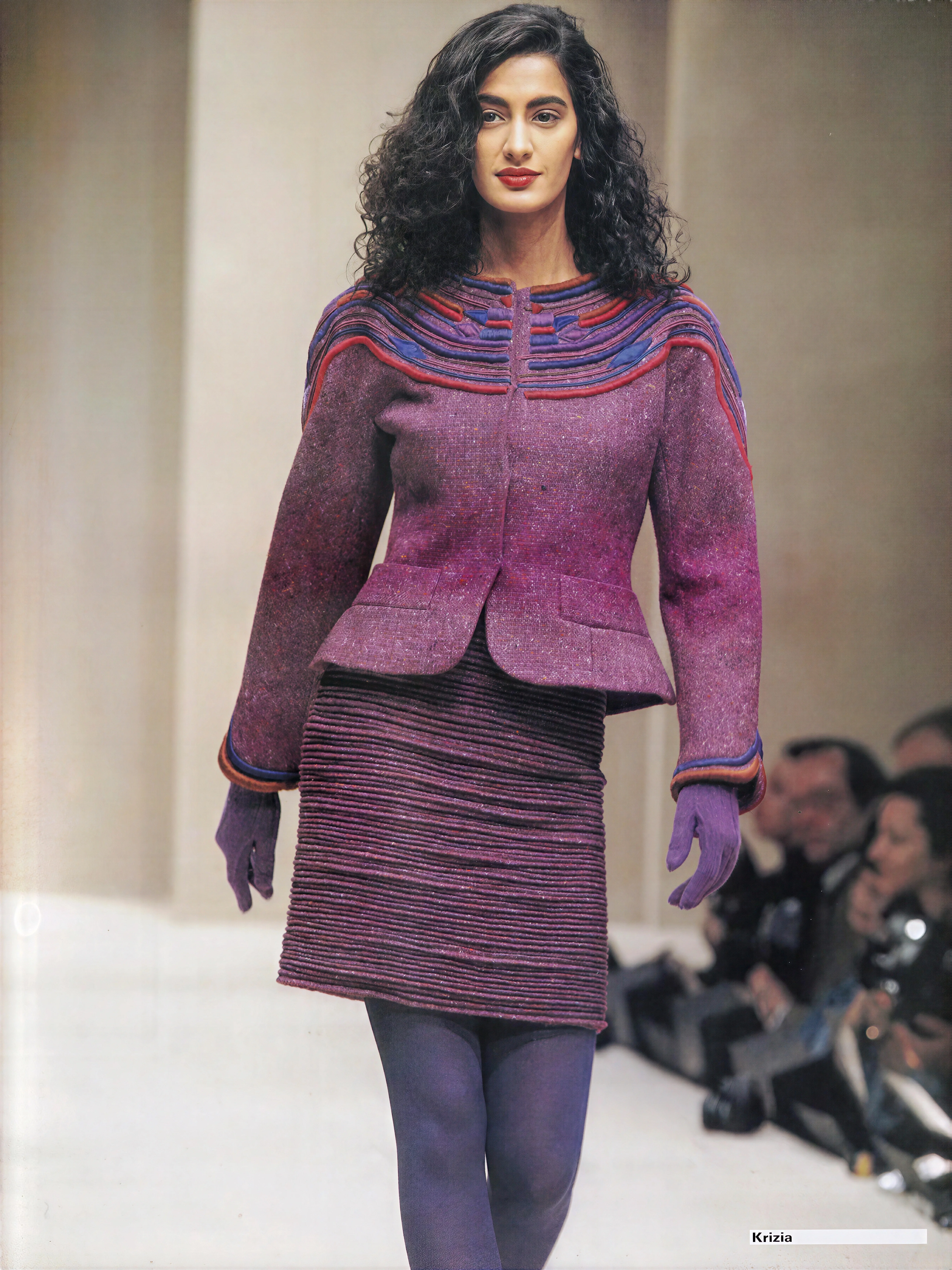
A contemporaneous Associated Press report described Milan's Fall 1991 week as quiet and businesslike, shadowed by the Gulf War and a sluggish economy. Krizia's business director, Aldo Pinto, supplied the blunt line: "This is no time for too happy clothes." The report lists knit leggings, printed tunic sweaters, office dresses and jackets, with primary red, blue and turquoise providing the drama. This suit belongs to that sober mood without becoming dour. Cord extends the shoulder without a giant pad; the waist is cut close and the peplum stays brief. Mandelli gets authority from mapping rather than mass.
Days Magazine's survey of Krizia from 1977 to 1989 describes a hybrid of Japanese avant-garde form and the high-glamour geometry of Claude Montana and Thierry Mugler. That account restores some necessary steel to a house often remembered for sweaters, but Mandelli wasn't simply standing between other designers. Montana and Mugler usually made silhouette carry the force. Here, applied lines do much of that work. Mandelli treated surface and structure as the same problem. Pleating, piping, metallic fibre and animal motifs weren't decoration added after a garment had been designed. They were often the design itself.
I can't tell from the photograph whether these bands are stuffed piping, braided appliqué or narrow tubes cut from several fabrics. The uncertainty is part of their appeal. They stand high enough to cast small shadows, turning trim into relief. At the neck they lie close together, then spread as they move across the shoulder, like a diagram made three-dimensional. One blue loop interrupts the red and purple sequence near the collarbone for no practical reason I can see. It is a tiny, deliberate snag in the system.
This is why reducing Krizia to the famous animal sweaters feels so inadequate. Those knits matter, and they helped turn the house into a serious commercial force, but they can obscure the severity underneath. W Magazine once called Mandelli's glamour sculptural and Kabuki-like, which catches the tension better than the usual language of whimsy. Even when a tiger crossed a chest, the garment around it was controlled. Nothing in this purple look is cute. The colours are rich, but their arrangement has the discipline of a wiring diagram.
Purple deserves more attention here than it usually gets. Mandelli doesn't place one violet on the body; she breaks it into wine, aubergine, magenta and blue, then lets texture alter each note. The jacket's nubbled weave absorbs light, while the raised cords catch it. The skirt goes darker because its close horizontal ribs create their own shadow. The gloves are flatter and almost chalky. From a distance the outfit reads as monochrome; close up it behaves like a disagreement among related colours. Red and blue prevent any single purple from settling into polite harmony.
Against the Chanel show that season, Krizia's piping looks quiet. The comparison is misleading. Chanel multiplied its symbols until chains, camellias and quilting became spectacle; Mandelli's cords don't quote the house, they show how this jacket has been thought through. Valentino's 1991 couture hid comparable discipline inside immaculate finish. Krizia leaves the working line visible. Your eye follows it from collarbone to shoulder, around the sleeve and back again, tracing decisions that another designer might have buried inside a seam.
I like that the jacket still has pockets. They are blunt, practical rectangles set against all that curving trim, and they prevent the look from becoming an exercise in pure graphic design. The small peplum gives them room, then falls away before it can turn sweet. Even the red edging is slightly unruly. It doesn't match the purple; it irritates it. Fashion colour is often discussed as if harmony were the goal, when a narrow strip of the wrong red can do much more work.
Sources:
-
Neo Classics — Los Angeles Times
-
KRIZIA Fall 1991/1992 Milan — Fashion Channel
-
Crazy for Krizia — W Magazine
-
KRIZIA '77–'89 — Days Magazine
Filed under Krizia
This post is timestamped using Blockchain technology. Verify